Official Logo Option Presentation
Precision Meets Integration.
Scroll to Explore
Brand Story & Brand Promise
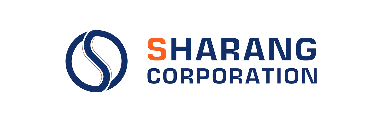
The Anatomy of the Mark
The Sharang icon is not just a lettermark; it is a piece of functional geometry engineered to represent integration, precision, and industrial strength.
01
The Bold "S" Monogram
Anchors the brand identity with a strong, recognizable letterform, ensuring immediate brand recall in both digital spaces and physical environments.
02
Continuous Circular Form
Symbolizes complete, end-to-end industrial solutions. It reflects reliability and the all-encompassing nature of Sharang's operational capabilities.
03
Flowing Geometry
The uninterrupted lines within the icon represent seamless connectivity across systems and processes, highlighting agility and innovation.
04
Balanced Structure
The precise weight distribution of the icon reflects stability, engineering excellence, and Sharang's unwavering commitment to long-term partnerships.
Typeface Square721 BT & Roboto
Aa
ABCDEFGHIJKLMNOPQRSTUVWXYZ
abcdefghijklmnopqrstuvwxyz
1234567890 . , ! @ # $ % ^ & : /
abcdefghijklmnopqrstuvwxyz
1234567890 . , ! @ # $ % ^ & : /
Square721 BT was selected for the wordmark to convey geometric precision and industrial stability. Roboto is used for supporting copy to provide excellent legibility and a modern, professional interface for all technical documentation.
Color Palette
#F15E2E
#11235A
#0F172A